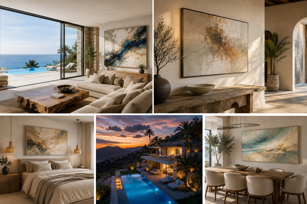
“I have a villa in Gran Canaria. How should I decorate it?”
It sounds like a simple interior-design question, but it usually contains several decisions at once: what colors work with the island light, how large the artwork should be, whether the house should feel coastal or contemporary, how to avoid a generic holiday-rental look, and how to make large white walls feel finished without filling every surface.
Gran Canaria homes are especially interesting because the architecture often gives you something many interiors elsewhere do not: strong natural light, large openings, pale walls, terraces, views and a close relationship between indoors and outdoors. That is an advantage—but it also makes weak decorating decisions more visible.
The goal is not to make your villa “look Canarian” in an obvious way. The goal is to make it feel as though it belongs here.
First: do not start by buying small decorative objects
One of the most common mistakes when furnishing a villa is to begin with cushions, vases, lamps and small framed prints before the room has any visual structure.
Start with the large elements: the sofa, dining table, bed, main wall, rugs, lighting and one or two important artworks. Once those are right, the smaller decoration becomes easy.
Art is particularly useful because a single large painting can solve several problems at once. It gives a room a focal point, connects the furniture palette, introduces emotion and makes an otherwise generic white wall feel intentional.
In many villas, one properly scaled original artwork does more than ten small decorative objects.
Gran Canaria light changes the way color behaves
Colors that look subtle in a showroom can become much stronger in a sunlit villa. Large windows, white walls and reflected outdoor light increase contrast throughout the day.
This is why extremely saturated interiors can become tiring quickly, especially when the house already has strong views, vegetation, blue sky or ocean outside.
A useful approach is to keep the architectural palette relatively calm and allow the art to carry more of the personality.
Warm whites, limestone, sand, greige, natural wood, soft taupe and stone tones work especially well as a base. From there, the artwork can introduce deeper Atlantic blues, mineral greens, amber, terracotta, ochre, black, gold or more expressive color depending on the room.
The important thing is not to copy the landscape literally. A painting does not need to contain a palm tree or a beach to feel connected to Gran Canaria.
A villa in Gran Canaria does not have to look like a “beach house”
There is a difference between coastal atmosphere and coastal cliché.
Generic nautical signs, anchors, shells, mass-produced turquoise prints and blue-and-white decoration can make an expensive villa feel like temporary holiday accommodation.
A more sophisticated approach is to borrow from the island indirectly: volcanic blacks, warm mineral tones, Atlantic blue, pale sand, dry grasses, aloe greens, weathered stone and the contrast between bright light and deep shadow.
These references can appear in texture and color rather than obvious imagery.
For example, an abstract work with deep blue, warm beige and fine gold movement can feel completely appropriate in a Gran Canaria villa without depicting the sea at all.
Choose the artwork by the wall—not by the painting alone
A beautiful artwork can look disappointing if it is too small for the wall.
When people visit a gallery, they often judge a work at close distance. At home, however, it may be viewed from four, six or eight metres away. Scale becomes much more important.
Above a sofa, a useful starting point is for the artwork to occupy roughly two-thirds of the visual width of the furniture below it. It does not need to follow that proportion mathematically, but a 70 cm painting above a 280 cm sofa will usually feel lost.
For large villa living rooms, formats around 140–200 cm wide can often look more natural than a group of small pieces. On very large walls, a 200–250 cm statement work may actually make the room feel calmer because the eye has one clear focal point instead of many competing objects.
If you are uncertain, visualization is extremely useful. Seeing the exact proportions of the painting on a photograph of the room can prevent expensive mistakes before anything is purchased or commissioned.
Living room: one strong decision is usually enough

The living room is normally where the biggest artwork belongs.
If the space already has dramatic architecture, panoramic windows or a strong sea view, the painting does not need to shout. A large calm composition can balance the room without competing with the exterior.
If the interior is very minimal—white walls, beige sofa, stone floor, simple furniture—the artwork can carry more contrast and become the main source of identity.
Try not to make every wall equally important. Choose one primary wall and let the other walls breathe.
This is especially effective in contemporary villas, where negative space is part of the design.
Dining area: use horizontal art to strengthen the architecture

Dining tables naturally create a long horizontal line, so a horizontal artwork often works beautifully behind them.
A wide painting can visually connect the entire dining zone and make it feel more architectural. For a long table, a work around 160–220 cm wide can feel much more appropriate than several unrelated small frames.
If the dining room is open to the living area, the two artworks should not compete. They can share one or two colors, but they do not need to match.
Matching art too literally can make a house feel staged. Related is better than identical.
Bedroom: lower contrast, more atmosphere

Bedrooms usually benefit from quieter art.
This does not mean everything has to be beige. Deep blue, smoky green, graphite, soft terracotta or dark mineral tones can work extremely well if the composition itself remains calm.
Above the bed, use a work that feels wide enough to belong to the furniture. A tiny central picture often makes a large headboard look even larger.
For a serene bedroom, look for visual movement that is slow rather than aggressive: layered color, broad shapes, soft transitions, restrained texture and enough empty space for the eye to rest.
Hallways and staircases are where smaller works become useful
Not every wall needs a large statement piece.
Hallways, staircases, landings and narrow transition spaces are ideal for smaller paintings, series or pairs. These areas are seen while moving, so rhythm matters more than one monumental focal point.
A pair of related works can lead the eye along a corridor. Four small paintings can create a clean grid. A vertical piece can emphasize a tall stair wall.
The key is to create a deliberate system. Random gaps and unrelated frame sizes are what make these areas look unfinished.
If the villa is a holiday rental, decorate differently
A villa that you live in permanently and a villa that must photograph well for guests are not exactly the same design problem.
For a rental property, art should create a memorable identity without becoming fragile or overly personal. Guests should remember the space as “the villa with the incredible blue painting” or “the house with the large abstract work above the sofa.”
One recognizable statement piece in the main living space can contribute more to listing photographs than many inexpensive decorations.
For high-traffic rental interiors, it is also sensible to avoid delicate glass-heavy framing in areas where luggage or furniture is frequently moved. Canvas works and secure floating frames are often practical choices.

Do not choose every painting to match the sofa
Interior art is not a cushion.
It is useful for a painting to communicate with the room, but exact color matching can make an interior feel flat. If the sofa is beige, the artwork does not need to be beige. It may need navy, black, green, amber or terracotta precisely because those colors are missing elsewhere.
A better question is: what does the room need?
A pale room may need depth. A dark room may need light. A room with many straight architectural lines may benefit from fluid movement. A very colorful space may need a quieter artwork to create balance.
Original art versus decorative prints
There is nothing wrong with prints, especially in secondary rooms. But if the goal is to make a villa feel distinctive, original art has a major advantage: nobody else has exactly the same object.
Texture also matters much more in bright island interiors than it does on a screen. Sunlight moving across a painted surface throughout the day can reveal relief, transparency, gloss, brushwork or raised lines that a flat reproduction cannot reproduce.
This is particularly visible in Moltenism, where transparent layers, flowing color and surface texture change depending on viewing angle and light.
For a main living wall, an original artwork can therefore become part of the architecture rather than simply an image placed on it.
What if you cannot find the right size?
This is extremely common in villas because the walls are often larger than standard domestic spaces.
If you like an artist’s language but cannot find the right dimensions, commissioning a work can be more sensible than compromising on scale.
A commission does not need to mean copying an existing painting. The artist can work from the required dimensions, orientation, general palette and atmosphere while still creating an original work.
This is particularly useful for difficult walls: very wide spaces above dining tables, tall vertical walls, spaces between architectural elements, large staircases or a room where several artworks need to relate to one another.
At MOLODA ART GALLERY, we create custom artworks by Olena Moloda and Walter Zakarlo for private interiors, including specific sizes, orientations and color directions. You can learn more on our Art Commissions & Gallery Services page.
Protect the art from the strongest direct sunlight
Gran Canaria’s natural light is wonderful for interiors, but direct sunlight is not ideal for most artworks over long periods.
If a wall receives hours of hard direct sun every day, consider a different placement, UV-filtering solutions for works behind glazing, blinds during the strongest hours, or choosing a more protected wall.
Also avoid hanging valuable works where condensation, repeated water exposure or intense heat is likely. Bathrooms, exterior terraces and walls directly exposed to weather require different materials from a normal living room.
Frames can completely change the result
For contemporary canvas paintings, a floating frame is often one of the cleanest solutions. The small gap around the canvas gives the work definition without visually enclosing it.
Black frames create stronger contrast. Natural wood can soften a space. White or pale frames can almost disappear into light walls. Metallic finishes should be used more selectively because too much gold can quickly make a modern villa feel formal.
The frame should support the artwork and architecture, not become the first thing you notice.
The easiest way to furnish a villa with art: solve one wall at a time
You do not need to buy every painting in one day.
Start with the room that matters most. Usually that is the living room. Find the correct work and scale for the main wall. Then move to the dining area, bedroom and secondary spaces.
Once the first major artwork is installed, it becomes much easier to understand what the rest of the house needs.
This approach also produces a more personal collection. A home assembled gradually usually feels more authentic than one where every object was bought from a single catalogue at the same time.
What we would do if you asked us to help with your villa in Gran Canaria
We would begin with photographs and measurements of the walls—not with a list of paintings.
We would look at the architecture, furniture, light, existing colors and sightlines between rooms. Then we would identify which walls actually need art, recommend proportions, and show suitable original works or create visual mockups so you can see them in the room before deciding.
If nothing available is right, we can propose a custom work in the required dimensions and general palette. Framing and installation can then be planned as part of the same process.
The purpose is not to fill every empty wall. It is to make the few important walls feel resolved.
A Gran Canaria villa should feel connected to the island without becoming a souvenir shop
The best interiors here often share one quality: they are relaxed without looking casual.
They use light, space and natural materials confidently. They do not overdecorate. And when they introduce color or art, it feels deliberate.
That is a much stronger expression of Gran Canaria than filling a villa with literal beach imagery.
If you are currently furnishing a villa, apartment or holiday property on the island, browse our available original artworks, visit MOLODA ART GALLERY in Las Palmas de Gran Canaria, or contact us with photographs and wall measurements. We can help you choose the right scale, visualize artworks in the space and create custom pieces when required.


Leave a comment
This site is protected by hCaptcha and the hCaptcha Privacy Policy and Terms of Service apply.