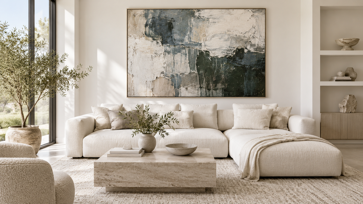
Choosing modern paintings for a living room sounds simple until you have to decide what will actually work on a specific wall. The difficult part is rarely finding an artwork you like. It is knowing whether it has the right scale, whether it will sit comfortably with the sofa, light, wood and textiles, and whether it will still have presence when the interior changes over time.
A contemporary living room does not need a painting that repeats the exact colour of the cushions, nor does modern art have to be neutral or abstract by default. What matters is whether the work has a convincing relationship with the room. These are the decisions that make the biggest difference.
1. Start with the wall, not the colour
Before thinking about beige, blue, terracotta or green, look at the geometry of the room. Where will the artwork hang? Above a sofa, console, dining table, or on a completely open wall? The width and orientation of that space usually matter more than the palette at the beginning of the process.
Above a long sofa, a horizontal painting with enough visual weight often works naturally. On a narrow wall between two doors, a vertical piece may make more sense. And on a broad wall without furniture beneath it, one large painting can organise the space in a way that several small pieces sometimes cannot.
If your main question is specifically about the wall above the sofa, our guide to choosing the right artwork size above a sofa gives useful proportions and examples. The measurements are universal even though that guide is currently in Spanish.
2. A modern painting does not have to “match” everything
One of the most useful choices is to decide whether the artwork should integrate with the room or contrast with it.
Integration means working with tones that are already present: cream, sand, warm grey, natural wood, black or a muted blue. The painting can echo some of those colours while still keeping enough variation and structure to avoid disappearing into the décor.
Contrast means allowing the artwork to become a focal point. A very neutral living room may benefit from deep blue, mineral green, rust, a restrained red or a graphic black-and-white element. Contrast does not need to be loud. A clear difference in temperature, brightness or intensity is often enough.

3. In a large living room, scale often matters more than quantity
A common mistake is to fill a large wall with many small pieces simply because they feel easier to place. Sometimes that works beautifully, but it can also fragment the room. A single generous work can create a clearer visual centre and make the whole interior feel more intentional.
This is especially noticeable with three- or four-seat sofas, high ceilings, large windows and long uninterrupted walls. A painting that measures 140, 160 or even 200 cm can feel enormous in a studio and completely proportionate once it is installed in the room.
The key is not to cover the entire wall. A large painting still needs breathing space around it. It should relate to the main piece of furniture while retaining enough empty wall to feel deliberate rather than crowded.

4. How to choose painting colours for a modern living room
You do not need to find an exact match for the sofa. In fact, when every colour is repeated literally, an interior can start to feel overly calculated.
A more natural approach is to identify two or three dominant elements in the room and decide what relationship the painting should have with them.
- With beige and light wood, blue-grey, dark green, terracotta, burgundy, graphite and restrained amber or gold accents can work particularly well.
- With grey, ochre, earth tones, warm beige and mineral colours can prevent the room from feeling too cold.
- With a lot of wood, you do not necessarily need more brown. Deep blue, mineral green or off-white can make the wood itself look richer.
- In a white living room, an artwork that is too pale can lose definition. One or two stronger tones may be enough to give the wall structure.
If your room is built around sand, cream or greige, our guide to choosing art for a beige living room explores that palette in more detail.

5. Abstract or figurative art for a contemporary living room?
“Modern” does not automatically mean “abstract”. A landscape, coastal scene or portrait can sit perfectly naturally in a contemporary interior when its composition, scale and palette have the right relationship with the room.
Abstract art is often easy to integrate because it does not impose a single narrative and allows colour, texture and rhythm to lead. A landscape can create a different effect: it may carry an emotional connection to a place and can visually open up a room. The choice depends less on fashion and more on what you want to feel when you enter the space.

6. Texture matters more than a screen can show
When buying art online, it is easy to judge only composition and colour. With an original painting, surface is also part of the experience: relief, brushwork, gloss, transparency and the way the material catches the light.
Those qualities can change the painting throughout the day. A texture that appears almost flat from the front may become visible in side light. A glossy area may reflect a bright part of the room, while translucent layers can produce a sense of depth that is difficult to reproduce in a photograph.
This is particularly relevant in Moltenism, the technique developed by Olena Moloda. Transparent layers, glossy surfaces and three-dimensional lines are part of the work itself. The light in the room becomes part of how the painting is perceived.
7. The frame can change the character of the painting
Floating frames work especially well in many contemporary interiors because they leave a small visual gap between the canvas and the frame. A black frame can add definition and structure; a light frame can sit quietly against a white wall or natural palette; wood can connect the artwork with flooring, doors or furniture.
But not every canvas needs a frame. A painting with carefully finished edges can look very clean unframed, particularly when the room has a minimal aesthetic.
8. Hanging height matters as much as size
Even the right painting can feel wrong if it is hung too high. Above a sofa or console, the work should feel visually connected to the furniture rather than floating close to the ceiling.
Instead of applying one rigid number to every room, look at the relationship between the bottom of the painting, the top of the sofa and normal eye level. Also consider whether the room is mostly experienced while sitting or standing.
9. Common mistakes when choosing modern living-room art
- Choosing too small. A beautiful piece can lose almost all of its impact on an oversized wall.
- Buying only by colour. Art should not become a temporary accessory that stops working when you replace the rug.
- Trying to fill every gap. Empty space is part of the composition too.
- Ignoring the light. The same painting can feel very different beside a large window and in a darker interior.
- Hanging too high. This breaks the visual relationship between art and furniture.
- Confusing neutrality with lack of character. A quiet painting can have considerable presence through scale, texture and tonal contrast.
10. What if no existing size fits the wall?
Some walls are simply difficult: an unusually wide sofa, a floor lamp that shifts the visual centre, switches, a nearby television or a very specific vertical recess. In those cases, a commissioned artwork can solve the space more naturally than forcing an existing painting to fit.
A commission should not mean copying another painting. It is an opportunity to create a new work within the artist’s language while considering orientation, dimensions, colour direction and the character of the interior.
A simple way to decide before buying
If you are choosing between two sizes or several artworks, a visualisation using a photograph of the actual living room can be much more useful than looking at measurements on paper. It lets you compare scale, hanging height, balance with the sofa and the relationship with other objects in the room.
At MOLODA ART GALLERY we regularly use interior visualisations to help clients narrow down their choice. You can also browse our selection of original paintings for living rooms and contemporary interiors or explore all original artworks currently available.
If you are in Gran Canaria, try the artwork in your own home
For clients anywhere in Gran Canaria, we offer free in-home artwork fitting and free local delivery. We can bring selected paintings to your home so you can see their real scale, colour and surface in your own light before deciding which one belongs in the space.
This is particularly useful with large originals and textured works, where a phone screen cannot fully show how the painting changes with distance and light. If you would like to try a selection in your interior, contact the gallery and send us a photograph of the wall together with its approximate measurements.
The best painting for a modern living room is not necessarily the most neutral, the largest or the one that most closely resembles the current décor. It is the one with the right scale, the one that gives the room something it was missing, and the one that remains interesting when you stop thinking about the sofa and simply start looking at the art.


Leave a comment
This site is protected by hCaptcha and the hCaptcha Privacy Policy and Terms of Service apply.